Regional Transportation District
Branding
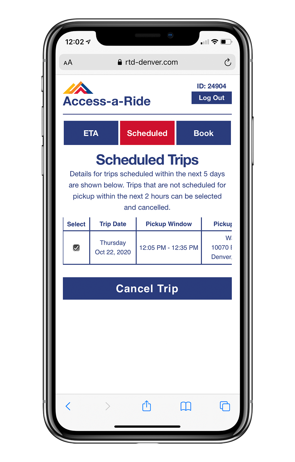
Working as a graphic and web designer for RTD, I have influenced the brand’s identity through updating brand standards including: forming a new icon library, employing a typographic style guide to ensure consistency between digital and print materials, redesigning graphic social media posts, and creating new, interactive web page designs. RTD is traditionally run as more of an operational government style, and board-advised company that struggles with many stakeholders input. By creating a visual brand guide for our digital and print materials, RTD is now able to point to these brand guidelines as a consistent voice of the company.
Letterhead & Memo

Transit Icons


ICON GUIDE: Brands are shaped in many ways. RTD’s iconography allows the agency the flexibility to enhance their communications with a graphic language that is notably theirs. I created a guide containing basic foundational design guidance and tools for creating iconography that fit with the RTD brand. This is an example of applying a corner radius that demonstrates intentional curvature. For example, actual train tickets tend to have rounded edges; therefore RTD’s iconography reflects that.